
How To Create A Graph In Excel

Reviewed By: Kevin Pocock

Table of Contents
Excel is a spreadsheet program that allows users to enter data into cells, perform calculations, and format the data visually, and is popular amongst both business owners and casual users.
One of the main advantages of the software is the ability to create and include graphs to display data, and this is a fast, easy process that can offer a brilliant visual representation.
Prime Day is finally here! Find all the biggest tech and PC deals below.
- Sapphire 11348-03-20G Pulse AMD Radeon™ RX 9070 XT Was $779 Now $739
- AMD Ryzen 7 7800X3D 8-Core, 16-Thread Desktop Processor Was $449 Now $341
- ASUS RTX™ 5060 OC Edition Graphics Card Was $379 Now $339
- LG 77-Inch Class OLED evo AI 4K C5 Series Smart TV Was $3,696 Now $2,796
- Intel® Core™ i7-14700K New Gaming Desktop Was $320.99 Now $274
- Lexar 2TB NM1090 w/HeatSink SSD PCIe Gen5x4 NVMe M.2 Was $281.97 Now $214.98
- Apple Watch Series 10 GPS + Cellular 42mm case Smartwatch Was $499.99 Now $379.99
- ASUS ROG Strix G16 (2025) 16" FHD, RTX 5060 gaming laptop Was $1,499.99 Now $1,274.99
- Apple iPad mini (A17 Pro): Apple Intelligence Was $499.99 Now $379.99
*Prices and savings subject to change. Click through to get the current prices.
Keen to learn how to create a graph using Excel? Then read on for all you need to know!
Types Of Graphs Available In Excel
There are a number of different types of graphs that can be created in Excel, and these include:
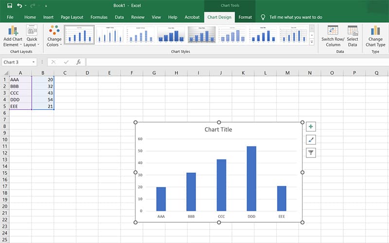
Bar Charts
Bar charts are often used for comparing two or more sets of data, as they allow you to see which values have the highest and lowest numbers at once.
The bars represent each set of data, with the height representing the value of the data.
Bar charts can also be stacked, meaning that the bars appear one over another, making it easier to compare multiple sets of data. You can also use bar charts to show trends over time.
Line Graphs
Line graphs are useful when you want to show the relationship between two variables over time.
They're particularly good for showing growth rates, as they make it easier to see if there has been an increase or decrease in the rate of change.
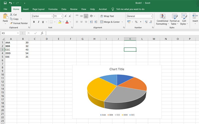
Pie Charts
Pie charts are great for displaying information about percentages, allowing you to quickly identify what proportion of your audience likes certain products or services.
They're also ideal for comparing the popularity of different items within a group.
The type of chart that you opt for will ultimately depend on the needs of your project, but Excel can handle all of these types of charts.
How Do I Add A Graph Into Excel?
Step
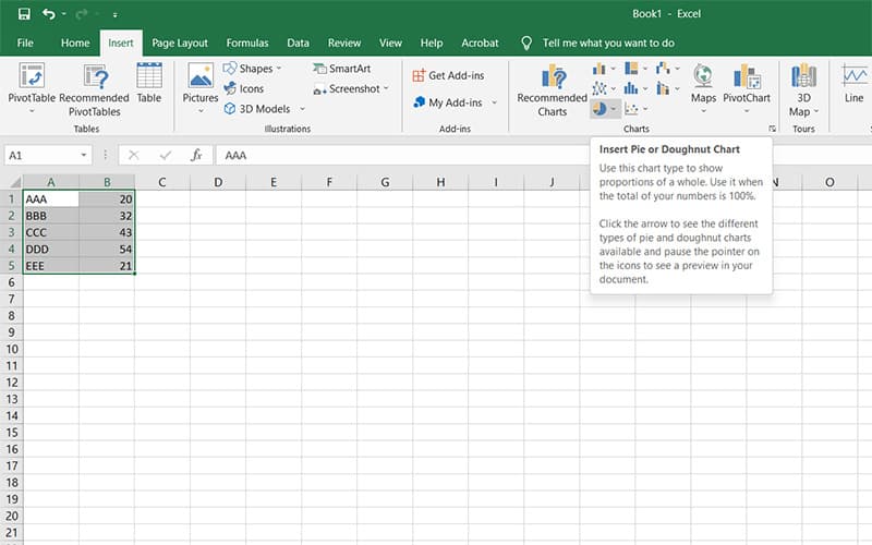
Click Insert Tab
To add a graph into Excel, click the Insert tab, then select Chart from the drop-down menu.
Step
Add A New Graph
From here, you can either add a new graph or edit an existing graph. If you wish to add a new graph, simply click New Chart, and follow the prompts.
Alternatively, if you already have a graph saved, you can just double-click on the graph to open it up so you can edit its properties.
Step
Adjust Settings
Once you've selected the graph you want to use, you can adjust some of its settings. These include the title, legend, axis labels, and other elements.
To view these settings, hover over the graph until you see the small arrow icon, and click the Settings button.
Step
Save Changes
Once you've made any changes you desire, you can save the graph by clicking Save As.
How Do I Use My Data To Create A Graph In Excel?
Step
Import Data Option
If you have a spreadsheet containing the data you want to use to create a graph, you can easily import this data into Excel using the Import Data option.
Step
Open File Menu
Simply click the File tab, and select Open. Then navigate to the location where you saved your spreadsheet, and select the file.
Step
Open File
After selecting the file, you will be prompted to confirm whether you want to open the file or not. Click Yes to proceed.
Step
Generate Graph
After opening the file, select the data that you want to include, head to Insert, and choose the type of graph that you wish to add in, and a graph will be generated which includes the data that you have selected.
Final Thoughts
Excel is a great piece of software and can help you to bring projects and presentations to life through the inclusion of charts and graphs.
By following just a few simple steps, you can transform your data, and create a stunning visual representation.
About the Author