
How to add a trendline in Excel – our guide to adding trendlines in charts

Reviewed By: Kevin Pocock

Table of Contents
If you want to know how to add a trendline in Excel, we’ve got you covered.
Excel allows its users to add different types of charts to their documents. These charts can help with presenting the information more professionally. To make them even better, you can add a trendline in these charts, which can be further customized as per your needs.
Prime Day is finally here! Find all the biggest tech and PC deals below.
- Sapphire 11348-03-20G Pulse AMD Radeon™ RX 9070 XT Was $779 Now $739
- AMD Ryzen 7 7800X3D 8-Core, 16-Thread Desktop Processor Was $449 Now $341
- ASUS RTX™ 5060 OC Edition Graphics Card Was $379 Now $339
- LG 77-Inch Class OLED evo AI 4K C5 Series Smart TV Was $3,696 Now $2,796
- Intel® Core™ i7-14700K New Gaming Desktop Was $320.99 Now $274
- Lexar 2TB NM1090 w/HeatSink SSD PCIe Gen5x4 NVMe M.2 Was $281.97 Now $214.98
- Apple Watch Series 10 GPS + Cellular 42mm case Smartwatch Was $499.99 Now $379.99
- ASUS ROG Strix G16 (2025) 16" FHD, RTX 5060 gaming laptop Was $1,499.99 Now $1,274.99
- Apple iPad mini (A17 Pro): Apple Intelligence Was $499.99 Now $379.99
*Prices and savings subject to change. Click through to get the current prices.
In this step-by-step guide, we’ll go through how to add a trendline in Excel so you can start making your charts look more professional.
How to insert a trendline in Excel
Here are the steps you need to follow to add a trendline in Excel charts.
Step
Open your sheet with the chart
First, open up Microsoft Excel and open the chart that you want to add a trendline to.
If you don’t have a chart, simply highlight the cells of a table, and click on the Quick Analysis button. Then, click on Charts and select a template.
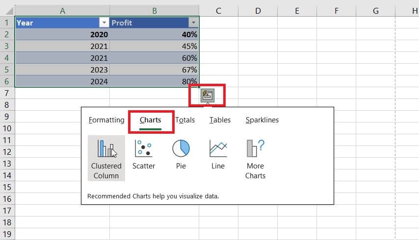
Step
Go to Chart Elements
After creating a chart, click anywhere on it, and three icons will appear on the right side.
Now, click on the Chart Element buttons, which is the first button from the top.
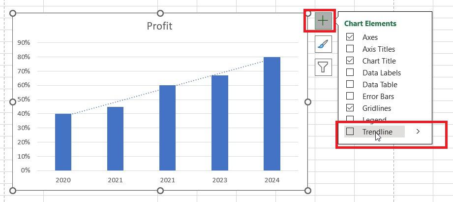
Step
Add a trendline
A drop-down menu will appear next to the symbol, with plenty of options to tick or untick, altering your chart in different ways. At the bottom of that list, you will find the “Trendline” option.
Tick it. This will add a linear trendline to your chart, which is a type of best-fit straight line.
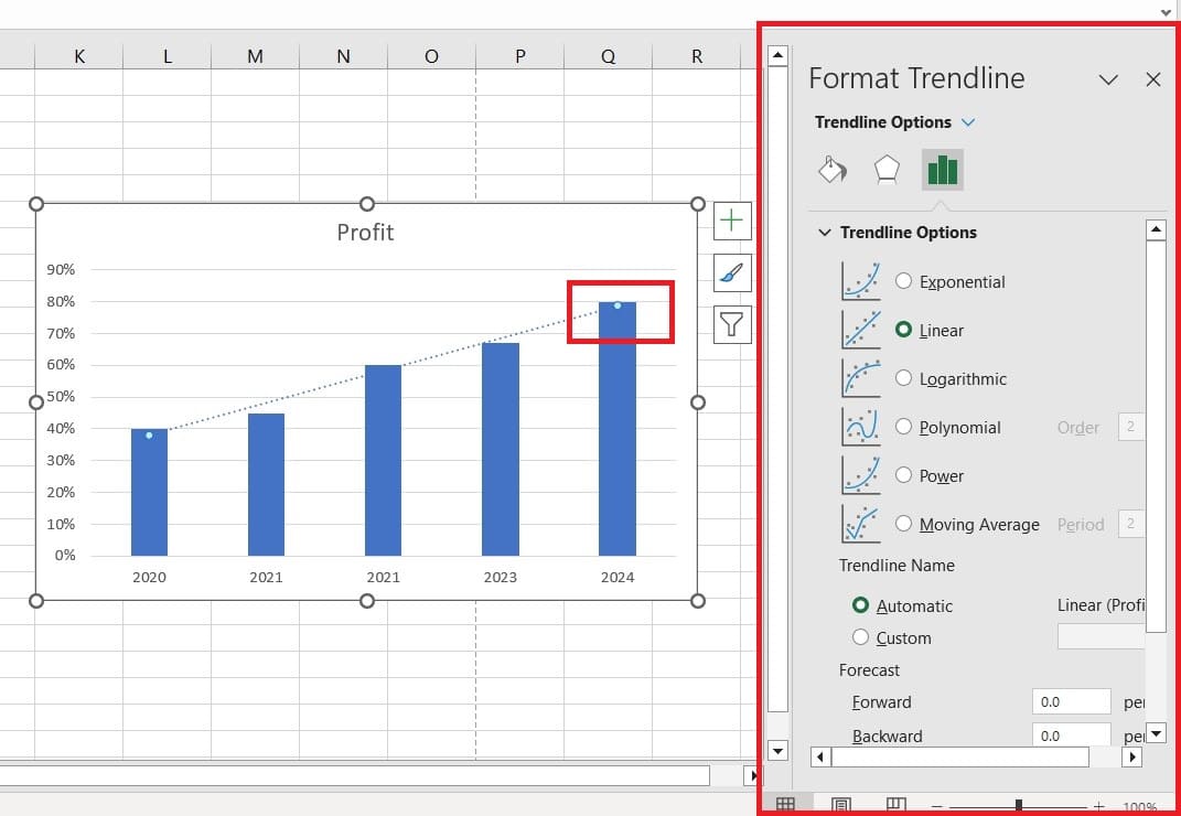
Step
Customizing a trendline
If this isn't the type that you want, or the type that is best for your data, then click on the trendline in the chart. An additional will appear on the right side, from where you can choose from several options.
Final thoughts
In this guide, we’ve discussed how you can quickly add a trendline in Excel. As you can see for yourself, if you already have a chart in your sheet, the entire process will take you less than a minute. On top of that, you can also later customize the trendline as per your requierments.
Learn more about Excel and how it works through these helpful guides:
- How to insert a checkbox in Excel
- How to create an Excel spreadsheet on PC and laptop
- How to merge two columns in Excel
About the Author