How to make a pie chart in Excel

Reviewed By: Kevin Pocock

Table of Contents
If you were looking for how to make a pie chart in Excel, we’ve got you covered.
A pie chart is one of the most frequently used charts in Microsoft Excel, and you may be wondering exactly why that is. The simple answer is that it's incredibly useful, especially if you're dealing with large amounts of data. Visualizing large data sets with a couple of clicks also boosts your efficiency. The best part is that Excel has built-in features for creating 2-D and 3-D pie charts.
So, without further ado, here's how to make pie charts in Excel.
Creating pie charts in Excel
Scenario on hand: We have a dataset with sales figures for a product.
What we want to accomplish: Explore how to make a pie chart in Excel by following these steps:
- Prepare your dataset
- Insert the pie chart
- Edit the pie chart
We also explore other Excel options:
- Using other types of pie charts
- Filtering a pie chart
Prepare your dataset
The first step before you create any Excel table is ensuring that your data is correct. If any numbers need to be added, add them.
Create your columns and rows of data. If you opt to label your data, these will be transferred to your pie chart later.
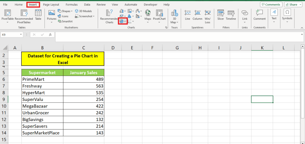
For our demonstration, we have created a fictional sales dataset of a product sold across different supermarkets.
Insert the pie chart
The pie chart option automatically calculates the percentages in the data. So, we simply have to select the entire table and click ‘Insert' from the ribbon.
Here, scroll down to Charts. Then click the Insert Pie or Doughnut Chart option (you can't miss it; it's in the shape of a small pie chart).
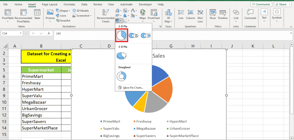
You should now see various options for creating your pie chart. This includes 2-dimensional and 3-dimensional pie charts.
To choose, you can hover the cursor over your preferred pie chart option to see a sneak preview of what it will look like for your data.
Once you've selected the most applicable chart, click it to be added to your page in Excel.
For our demonstration, we choose the simple 2-D pie chart.
This is the pie chart we get:
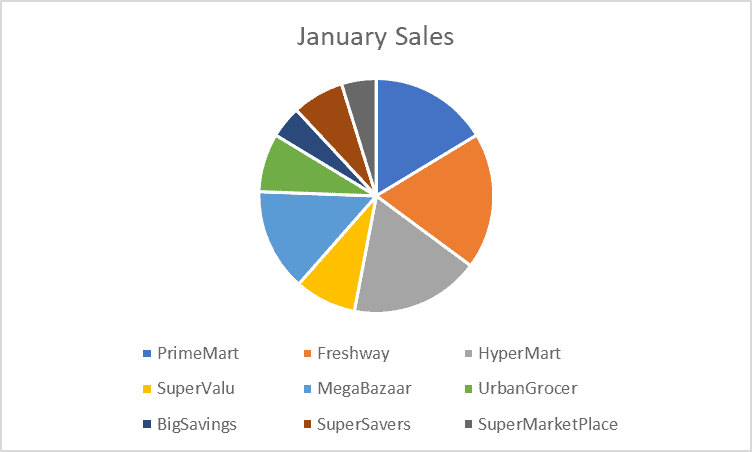
In the third step, we will edit this pie chart to look more professional.
Edit the pie chart
If you've made a pie chart but aren't happy with the chart type, you don't need to worry! It's relatively easy to make some changes. But if you don't know how to make these changes, we've outlined some simple methods below.
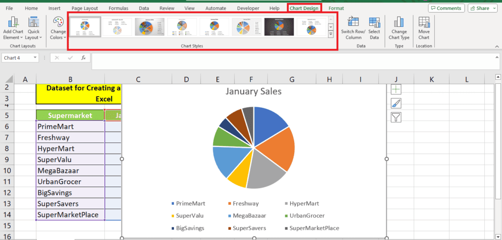
Using ready-made pie chart styles
If you're working with a newer version of Excel, you will get a range of ready-made chart styles to choose from. These chart styles look professional, and you can use them as they are or with slight modifications.
Upon selecting the chart, you can browse through the list of chart styles when a ‘Chart Design' tab appears on your ribbon.
For our demonstration, we will not choose from these automatic styles. We will explore manual ways to edit your chart so you can modify your chart as per your liking or needs.
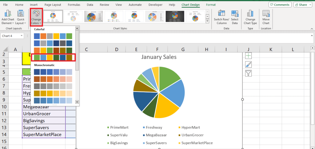
Pie chart colors
You will see the option to change the chart colors beside the chart styles.
Since we have several data points, monochromatic colors won't be suitable. So, we select this color palette to reduce the number of colors on the chart but ensure that every data point is distinct:
Pie chart title
If you want to change the chart’s header, all you need to do is double-click the title and enter the new name.
You can also change the positioning of the chart title by dragging it around.
Clicking on the chart title also opens a ‘Format Chart Title' window on the left.
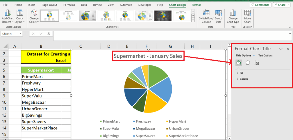
Here are the edits you can make from this window:
- Change the background of the chart title text box (solid fill, gradient fill, picture or texture fill, pattern fill)
- Change the border of the chart title text box (no line, gradient line, solid line, color, transparency, width, dash type, etc. )
- Adjust the shadow, glow, edges
- Align the chart title text box
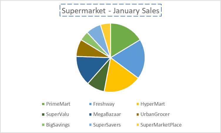
We added dashes to the chart title text box's border:
Pie chart area
When you click on the background of the pie chart, Excel will open up a ‘Format Chart Area' window on the left. Here, you can change the background color, add texture to the background, and even soften the edges.
Here's how the softened edges look:
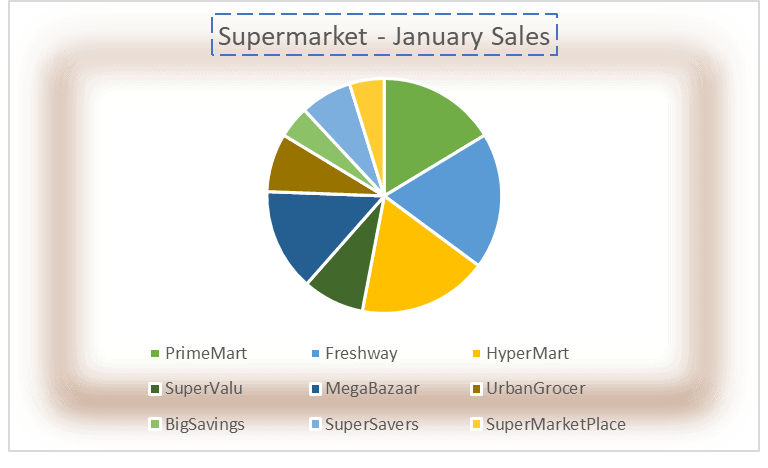
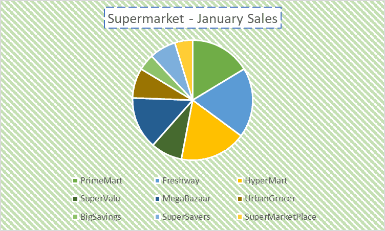
To make our chart look professional, we added a pattern to the background and changed the background of the chart title text box to white for better visibility:
Editing data labels
Data labels are the most critical aspects of any chart. In pie charts, legends are depicted with color, and percentages are only illustrated by the size of the pie slice.
However, we want to add data labels to our chart so it becomes more descriptive.
To change data labels, head to ‘Add Chart Element' under the ‘Chart Design' tab. Go to data labels and choose the data label type you need.
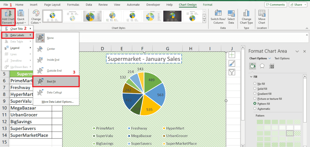
For the best look, we choose the ‘Best fit' option. But we want the data labels in percentages.
To change the data labels from units sold to percentages, we select the data labels to open the ‘Format Data Labels' window.
From this window, we change the label options to ‘Percentage' instead of ‘Value':
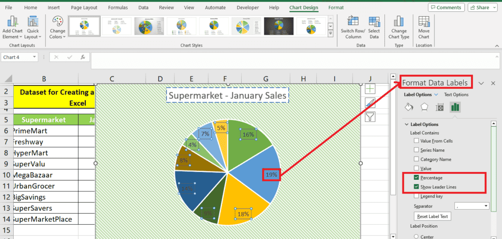
Under ‘Format Data Labels, ‘ we select ‘Text Options.' Here, we change the text color to white and add a shadow to it.
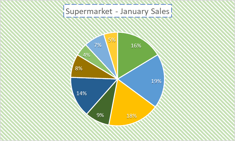
Here is what our chart looks like now:
Explore the pie chart
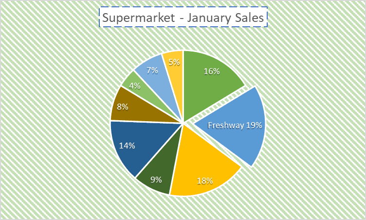
We want to take out the biggest slice of the pie to highlight it for the sales team. You can also do this by simply double-clicking on the piece you want to pull away. Then, drag your cursor until it's the distance you want it, and you're all set!
We also type the supermarket's name on the label to specify the name. Here is what it looks like now:
Other types of pie charts
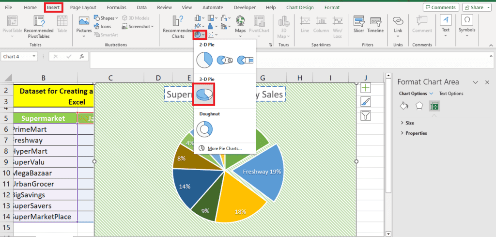
3D pie charts
You can convert your creation to a 3D pie chart using the same option you used to add the chart:
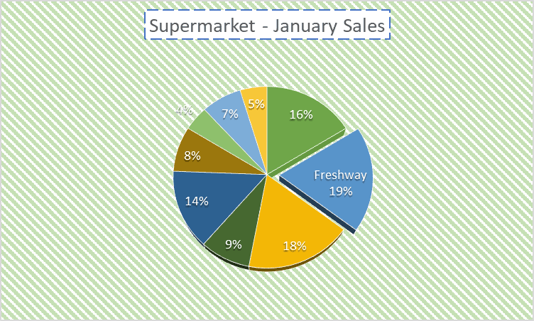
Here's how it looks like converted to 3D:
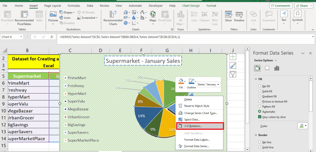
Right-click the pie and click ‘3-D Rotation'. This will allow you to rotate your 3D pie to whichever angle you prefer:
Pie of pie and bar of pie
Pie of pie is a great way to minimize the number of slices in your pie and create a separate pie for the smallest values in your data.
When we press ‘Pie of pie,' it consolidates the smallest three values into a separate pie:
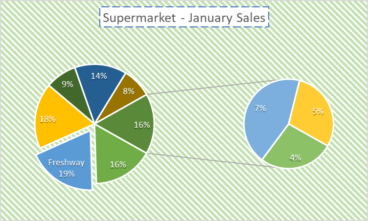
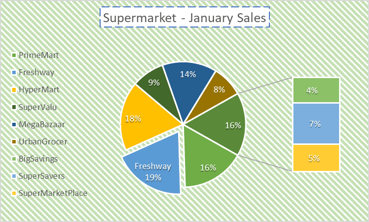
The bar of the pie is another way to represent the smallest three values in your data.
As the last step, we added the legend to the left.
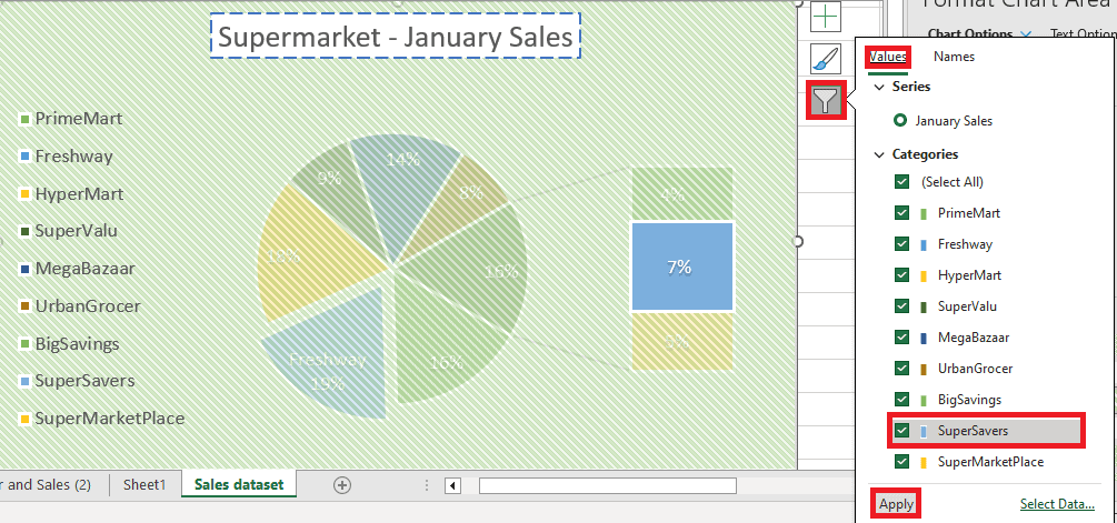
Additional option: Filter the pie chart
If you wish to filter out some values from your pie chart, click the funnel symbol on the top left corner of your chart area.
Unselect the values you want to filter out and click ‘Apply':
Wrapping up
Pie charts can visually represent vast amounts of information in a relatively compact space. They break the data down and allow you to illustrate exactly how several values can make a whole in the form of pie slices.
In this guide, we explored the basic pie chart and how we can convert our data into stunning visual representations using Excel’s editing features.
Check out these in-depth guides to learn more about Excel.
- How to use VLOOKUP and SUM across multiple sheets in Excel
- How to remove duplicates using VLOOKUP in Excel
- Excel: How to use column index number in VLOOKUP
About the Author