How to create a stacked bar chart in Excel – step-by-step guide (with images)
Table of Contents
A visual representation of your data is one of the most effective ways to interpret and derive meaning from raw data. Visual representation includes different types of graphs, charts, box plots, and scatter plots.
In this article, we explore how to create one of the most common and valuable charts available in Excel — the stacked bar chart. You can create a stacked bar chart in 2D or 3D in Excel. We will lead you through its creation, modification, and editing so you can create your own stacked bar chart when needed.
What is a stacked bar chart?
A stacked bar chart is a great way to compare data from two different segments, categories, or variables.
A stacked chart has bars or columns stacked on top of one another. The bars can also have sub-elements, which are colored to show the parts of a total figure.
How to make a stacked bar chart in Excel
Scenario on hand: We have a sales dataset in Excel.
What we want to accomplish: In our article, we will work with a sample sales dataset to generate 4 different types of stacked bar charts in Excel. Here are the types of charts we will cover in this article:
- 2-D stacked bar chart
- 100% 2D Stacked Bar Chart
- 3-D Stacked Bar Chart
- 100% 3-D Stacked Bar Chart
Throughout this article, we will also explore how to format and edit your charts so you can improve your visual representations.
Organizing your data
Before we get on to the different types of stacked bar charts, let's first explore how you can organize your data. For the chart to accurately depict your raw data, it is essential to ensure that no information is missing.
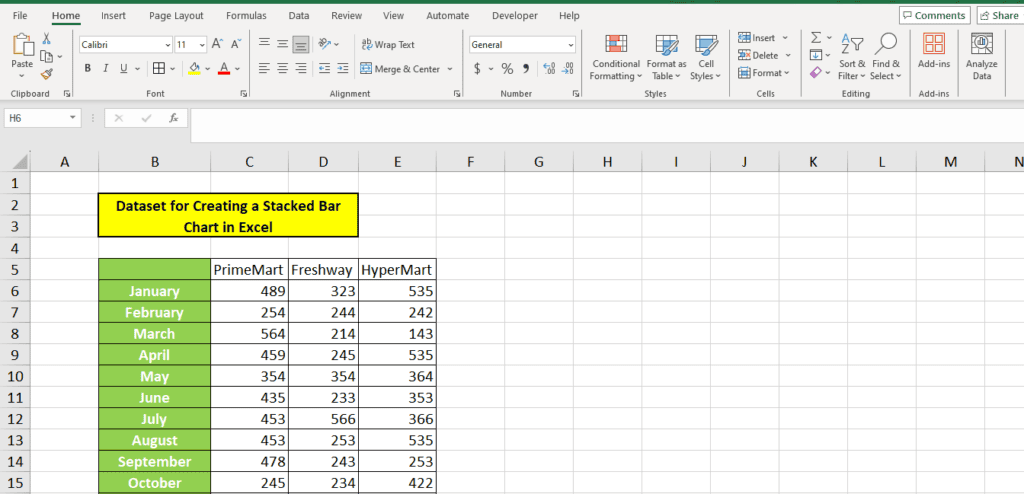
We have taken a monthly sales data comparison of three supermarkets for our demonstration. Here is how we have organized the data so it looks clean:
2-D stacked bar chart
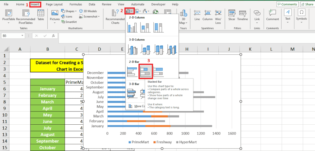
To insert a 2-D stacked bar chart, first select your organized data. Then follow the steps as illustrated below:
Step 1: Choose the chart type
To choose the chart type, go to Insert from the top ribbon and go to the bar and column chart options in the Charts toolbar. From the 2-D charts, select the 2-D stacked bar chart:
Here is how our chart comes up:
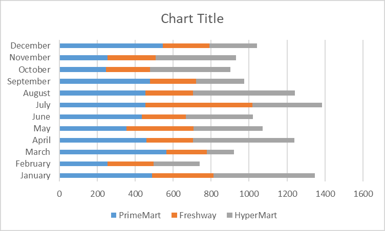
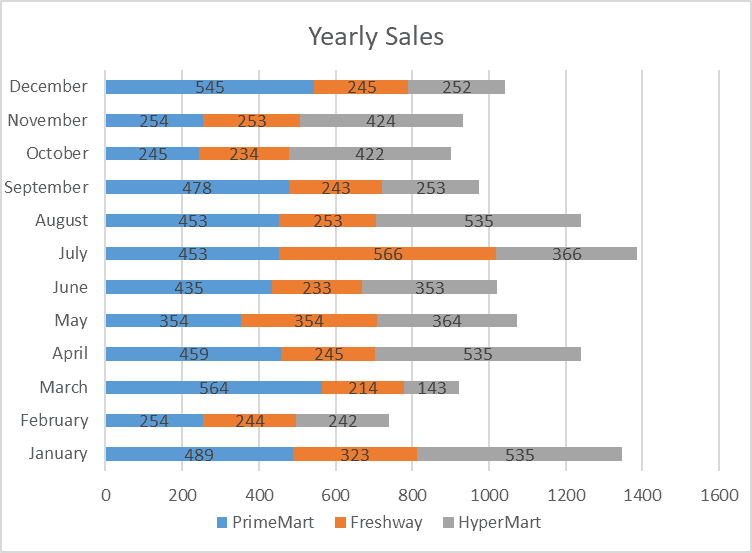
Since we have 12 months of data, the months are on the y-axis, and the sales figures are on the x-axis. The bar colors indicate the supermarkets in our data. The legend shows which supermarket each color represents.
Step 2: Inverting the chart
Let's suppose we want the months as the bar colors. There is a clever shortcut in Excel for inverting the chart.
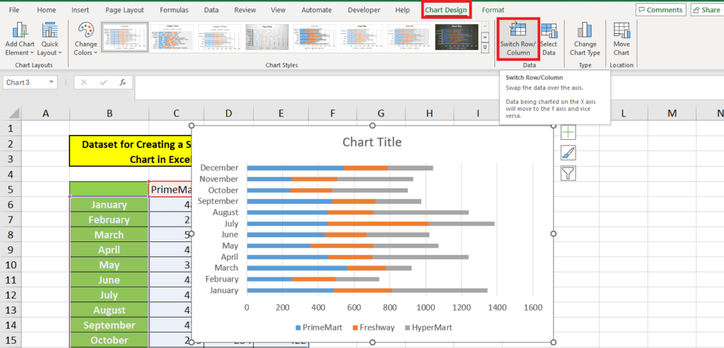
When you select your inserted chart, you get an additional Chart Design tab on your ribbon. Select this to reveal the option Switch Row/Column. Simply press this button to switch how the chart is displayed:
Here's the chart we get when we use this option:
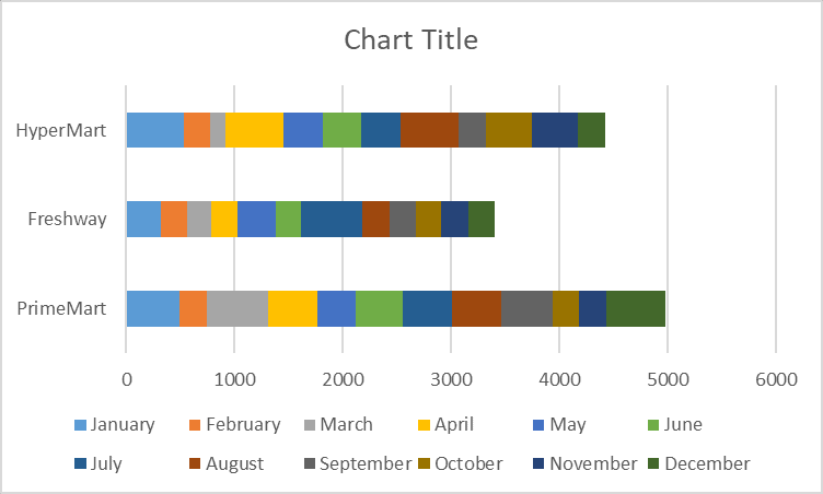
The bars’ many colors make it difficult to make sense of the data. To switch it back, we can use the same button again. However, this option might be useful if you don't have many data categories.
Step 3: Editing the chart
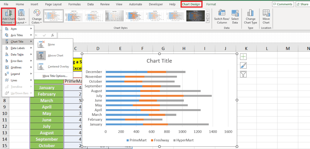
You might have noticed that our chart has “Chart Title” in place of a title. If we want to remove this title, we can simply click on it and press delete. However, a better option is to use the Add Chart Element option to add or remove chart elements like title, legends, horizontal lines, vertical lines, axis titles, and data labels.
You will find this option on the far left under Chart Design:
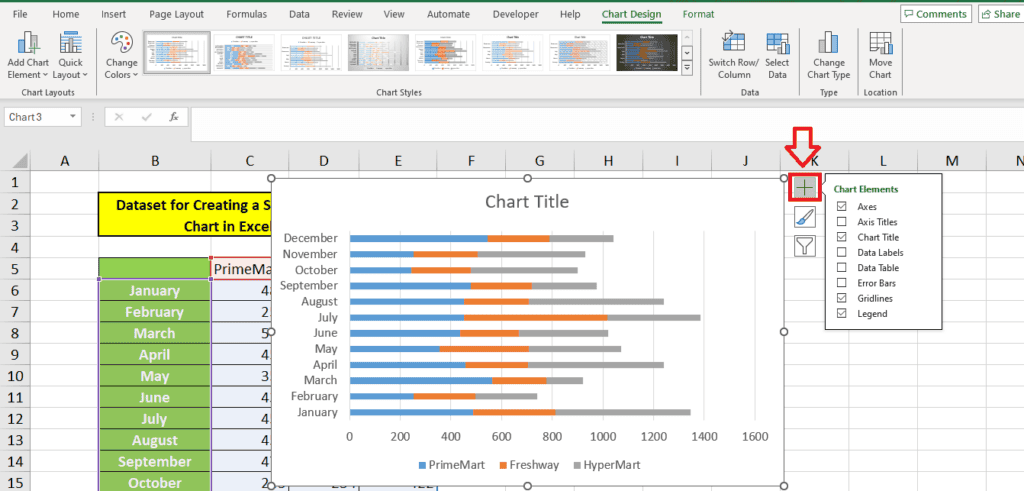
Alternatively, you can also use the + sign on the right side of the chart to add or remove chart elements quickly:
We want to add data labels to the chart so everything looks clear. We use the Add chart element option to do this. This is what our chart looks like now:
Step 4: Formatting the chart
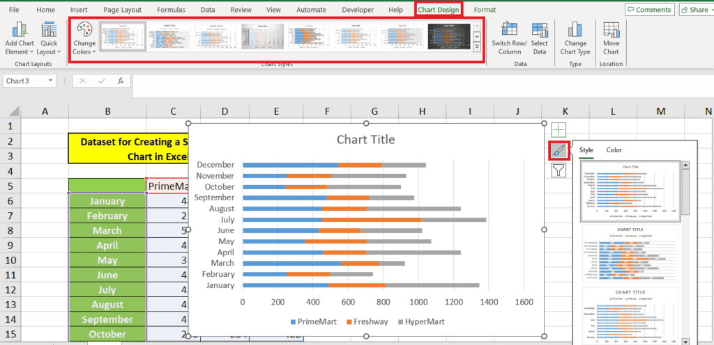
To change the chart's colors and design, use the Chart Styles toolbar under Chart Design or click the paintbrush icon on the left of the chart below the + symbol:
100% 2D Stacked Bar Chart
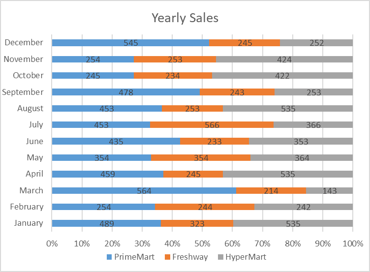
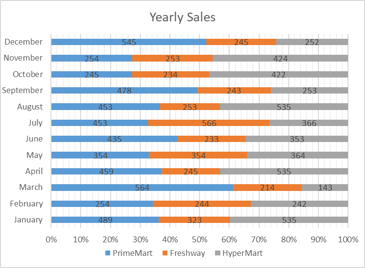
The 100% stacked bar chart shows the data as a % of the total. In our case, it will show the % of sales each supermarket attained per month. As a result, the bars will not be of varying lengths.
Step 1: Changing the chart type
If you already have a chart and want to change it to a 100% stacked bar chart, there's an option under chart design that can help you. This option is called Change Chart Type, and from this option, we choose the 100% stacked bar chart:
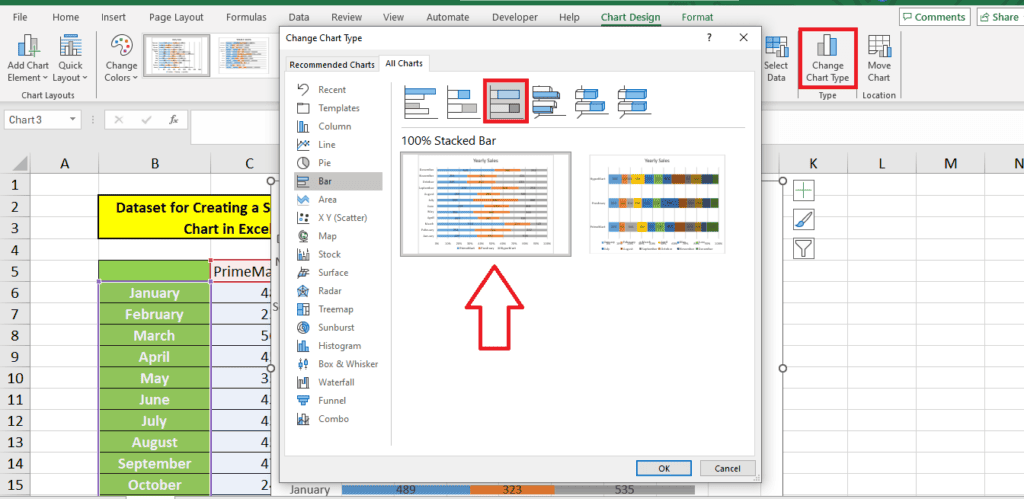
We choose the 100% stacked bar chart. Here's what the chart looks like:
Step 2: Changing the gridlines
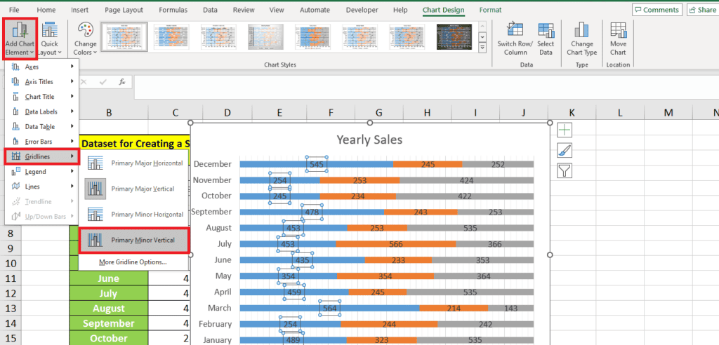
Although the y-axis shows gridlines at every 10%, we can add more gridlines to improve the visual representation.
For this, we go to Add Chart Element > Gridlines and add Primary Minor Vertical gridlines to get more gridlines:
Here's what our chart looks like now:
3-D Stacked Bar Chart
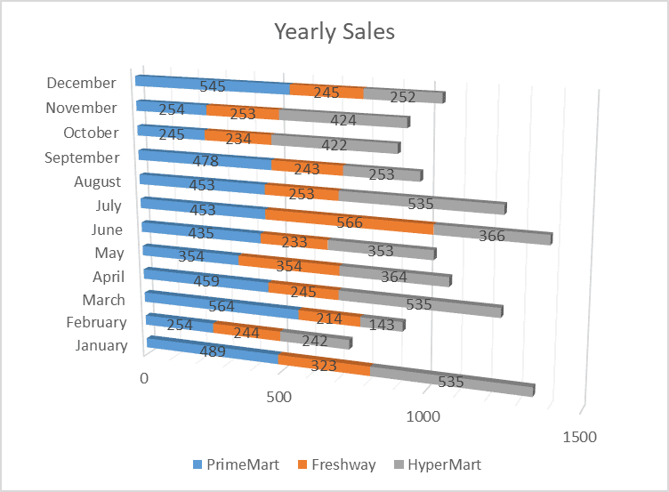
The 3-D stacked bar chart is similar to the 2D stacked bar chart, with a slight variance in the chart style. The bars in a 3D stacked bar chart look three-dimensional. You can find this option under Change Chart Type.
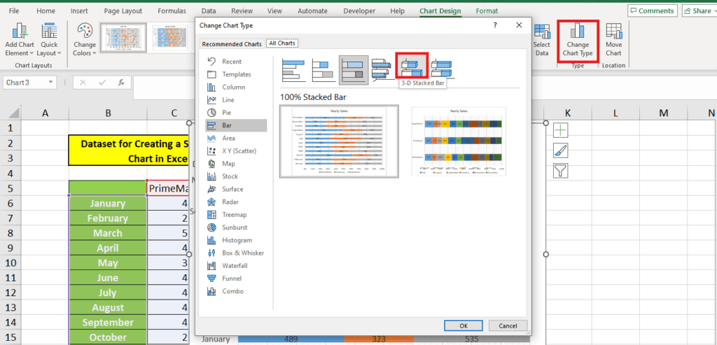
You can even find this chart type under 3D when you're first inserting the chart.
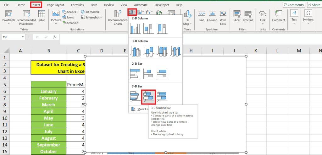
Here's what a 3D stacked bar chart looks like:
We changed the chart style for this 3D stacked bar chart, and here's the result:
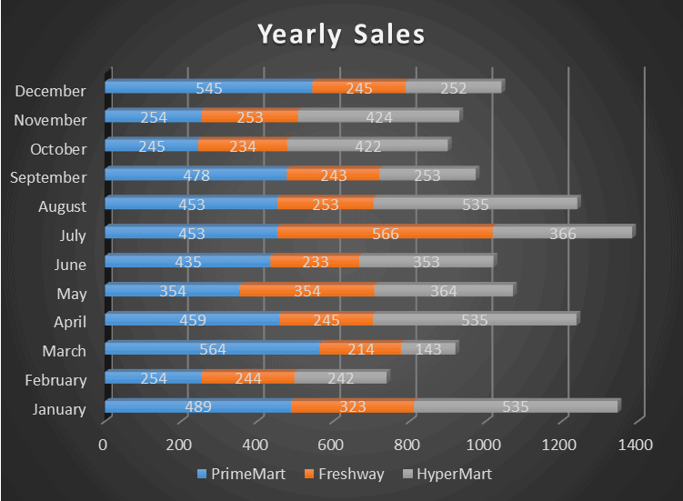
This is a much better representation of our data than the chart we first started with. In Excel, you have many options to modify your charts, making them look just the way you like for your presentations and accurately representing your data.
100% 3-D Stacked Bar Chart
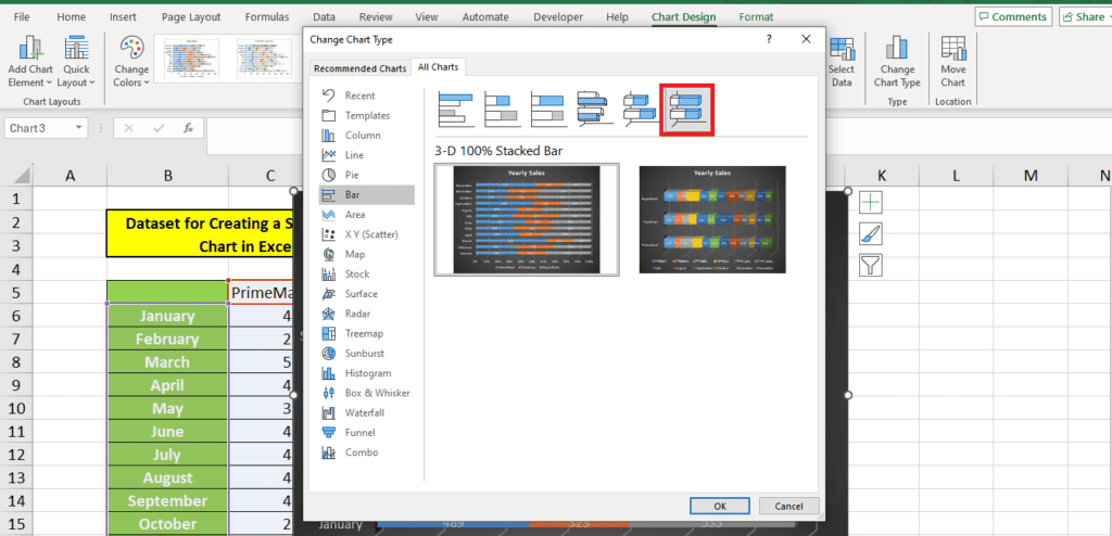
You can also make a 100% 3-D stacked bar chart. This is similar to the 100% stacked bar chart, just differing in style:
Advantages of a stacked bar chart in Excel
A stacked bar chart is one of the most useful charts available in Excel. Here are some advantages of creating a stacked bar chart in Excel:
- Excel has tons of options to create 3-D, professional-looking charts.
- Stacked bar charts allow you to create a data representation that can be understood easily.
- The chart can be copied to your presentation or reports.
- These charts will enable you to depict changing data over time.
- They can be used to illustrate a part-to-whole ratio quite effectively.
Disadvantages of a stacked bar chart in Excel
Even though Excel allows you to create different types of stacked bar charts, there are some disadvantages to using these charts for your data:
- Excel does not automatically calculate data percentages. The 100% stacked bar chart can only convert data labels to percentages if you use a pivot table or calculate percentages separately.
- If you have a lot of categories, the stacked bar chart can quickly become very cluttered. For instance, in our case, if we wished to see the month-wise performance of each supermarket, we were stuck with a cluttered representation of the data.
Wrapping up
Our article explores how to create different types of stacked bar charts in Excel and covers the various options for editing and formatting your chart to make it more appealing and relevant to your use.
Learn more about charts in Excel through these guides:
