How to make a Gantt chart in Excel – our step-by-step guide

Reviewed By: Kevin Pocock

Table of Contents
Want to know how to make a Gantt chart in Excel? We’ve got you covered.
Excel isn’t just about sorting data in columns and rows, as you can also use charts to present the information, such as Gantt charts. These are perfect for displaying project schedules. In other words, they can be used to show the start and finish dates of a project. However, many people get confused about how to make them, as the process can be challenging for new users.
This is where we come in. In this step-by-step guide, we will show you how to create a Gantt chart in Excel so you can start making your sheets look more professional.
How to create a Gantt chart in Excel
Scenario on hand: We have a dataset with project milestones and start and end dates.
What we want to accomplish: Explore how to make a Gantt chart in Excel by following these steps:
- Use Excel to list your project's schedule
- Turn your data into a bar chart
- Add the starting dates to the Gantt chart
- Add durations
- Add descriptions
- Format the Gantt chart
Step
Use Excel to list your project's schedule
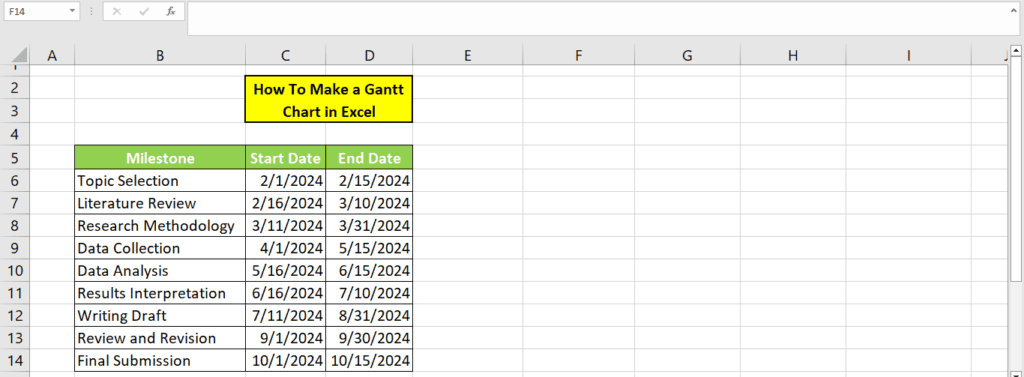
In the first step, you will need to break your project down into phases of work, with individual stages with clear beginning and ending dates.
In our demonstration, we have created a list of 9 phases with the start and end date of each phase.
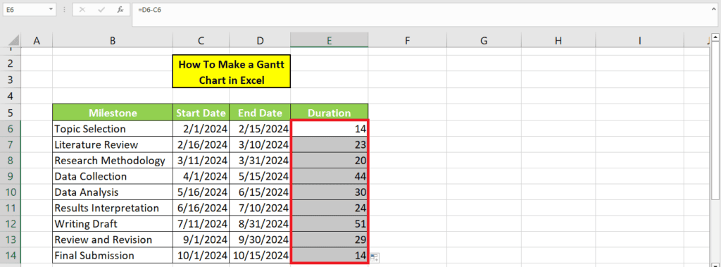
We create another column for the duration by subtracting the end date from the start date. In our case, this will be D6-C6 for the first cell. We then use the Fill Handle tool to change the formula for the entire table dynamically.
Step
Turn your data into a bar chart
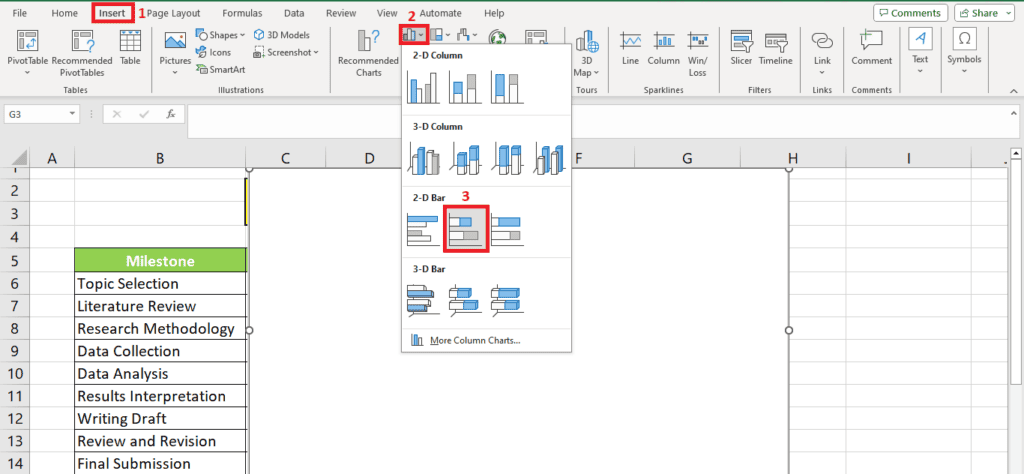
Once you've filled out your table of phases, click on a blank cell. “Once you've clicked on one, go to the top of the screen and click the “Insert” heading.
From the options that appear beneath it, find the “bar Chart” just to the right of the middle. Then, from its drop-down menu, click “Stacked Bar” from the “2-D Bar” section. A blank chart space will appear.
Step
Add the starting dates to the Gantt chart
To add the data to this blank chart, click your right cursor on the blank chart, then hit “Select Data…”.
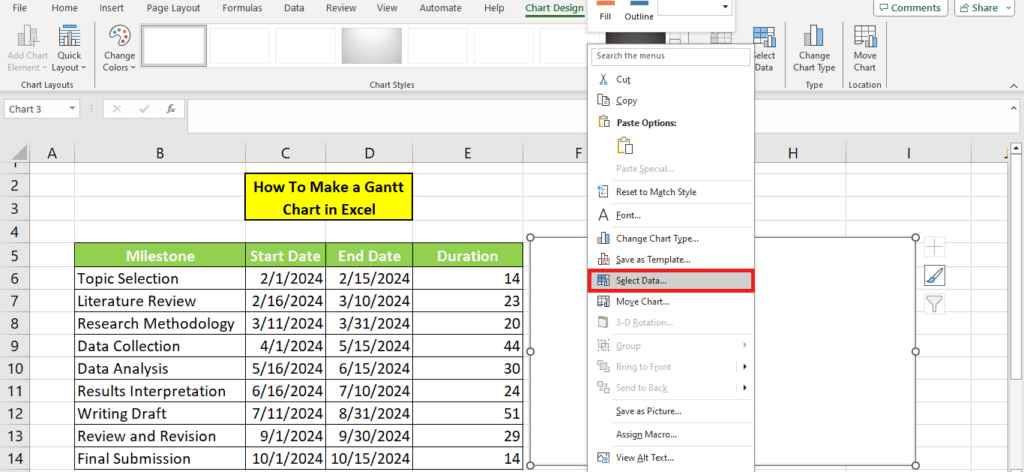
On the new window, select “Add” from the left box.
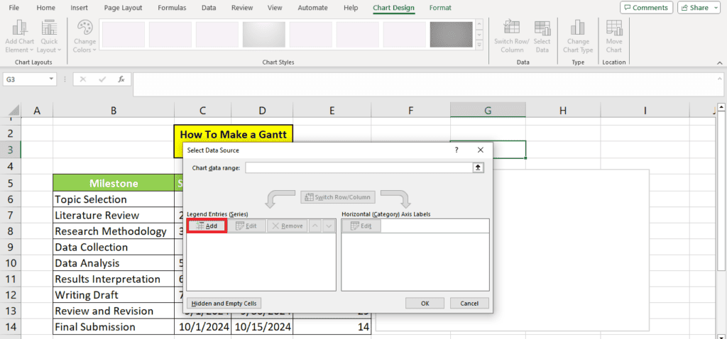
A window for “Edit Series” will open. Click the box under “Series name,” followed by the “Start Date” column heading of your table.
Then click the box beneath “Series values” before clicking on the first starting date from your column and dragging the cursor to the final starting date. Click “OK”.
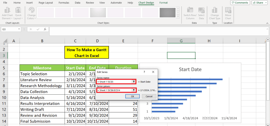
The Gantt will now have all “Start Dates” added. In the next step, we will add the other columns.
Step
Add durations
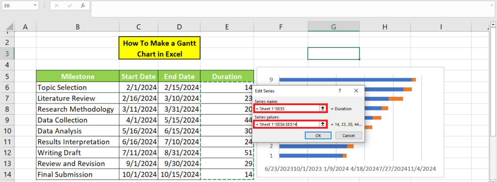
Now, we will repeat the same steps for the “Duration” column. On the bar chart, “Select Data…” again and click “Add.”
When the window for “Edit Series” opens, select the “Duration” column header as the “Series name” box. In the “Series values” box, select all the duration values before clicking “OK.”
Step
Add descriptions
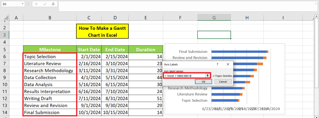
Next, click your right cursor on a blue bar and click “Select Data” again. This time, you will not click “Add” but go to the “Edit” button on the left. This option will allow you to edit the labels of each bar on the chart.
Select all milestones when the window asks you to select the “Axis Label Range.”
Step
Format the Gantt chart
Right now, the chart will not look like a Gantt chart. So, formatting the Gantt chart is necessary to complete it.
To do this, click your right cursor on a blue bar, then click the bottom option for formatting data.
Next, click the paint bucket icon, then tick the option for “No Fill.” Then hit “Border” and select “No Line.” Visually, your chart will now look more like a Gantt chart.
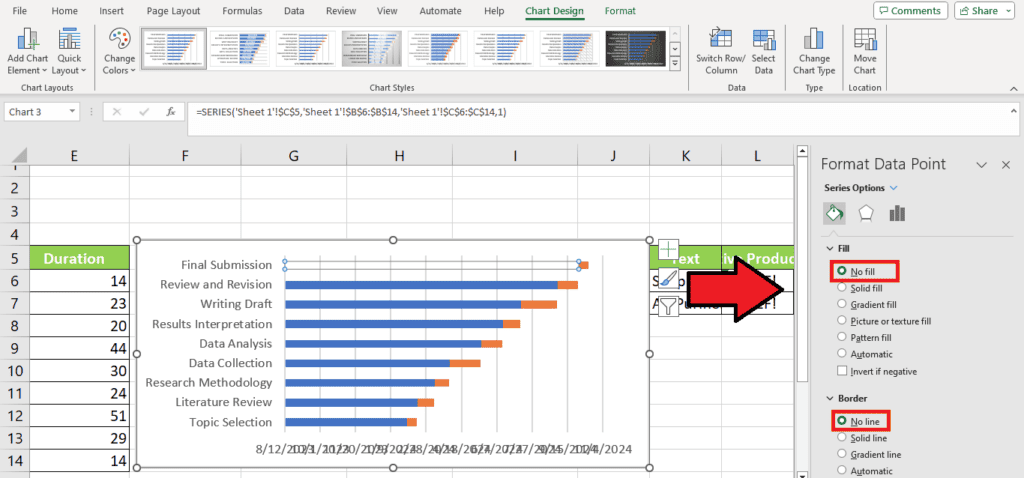
Do this for each blue line on the chart.
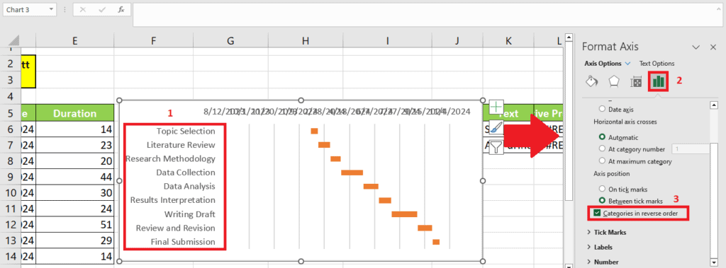
You might see that the first entry on your table is at the end. To correct this, you will have to reverse your chart headings.
First, click on their axis to reveal the “Format Axis” options. Select the “Bar Chart” icon, then tick “Categories in reverse order.”
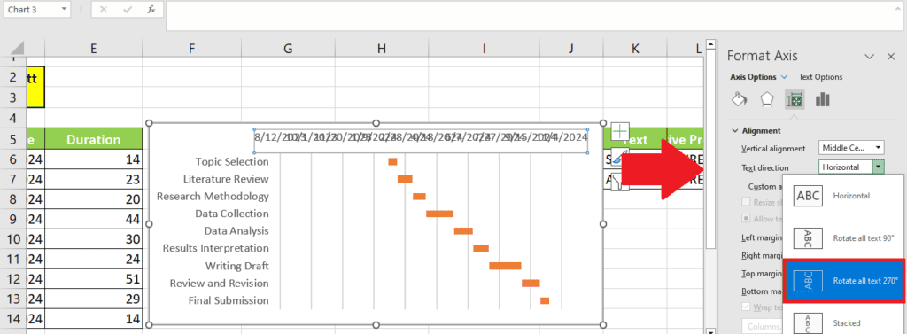
Other formatting options
Select the axis with the dates and change the text direction like this:
Change the date format in the Gantt chart
You can also change the date format in Excel to make the Gantt chart more appealing. First, select the date column, then head to “Number” on the Home tab and click “More Number Formats.”
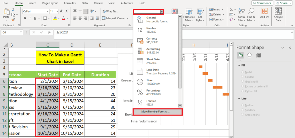
Select the format according to your liking. The table will automatically reflect the changes in the data.
Change the minimum date in the Gantt chart
At times, your Gantt chart will include dates prior to the start date. To change this, go to the Axis options and change the Minimum like this:
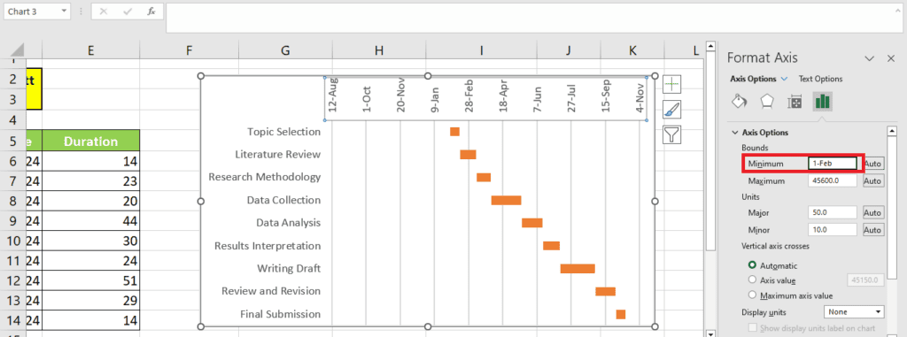
Also, change the “Major” units to 30 to display the progress per month.
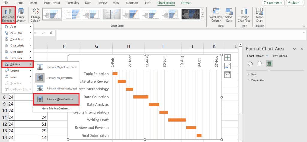
Add additional grid lines to the Gantt chart
You can even add additional grid lines to your chart for clarity. Under the Chart Design tab, located “Add Chart Element”. Click “Gridlines” and add your desired gridlines. We added the “Primary Minor Vertical” gridlines.
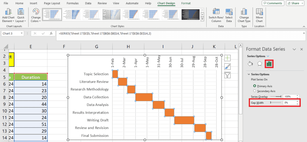
Change the gap width
Explore options like gap width to change the gap between the bars:
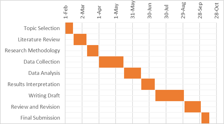
This is what our final Gantt chart looks like:
Wrapping up
And this was how to create Gantt charts in Excel. Gantt charts are very helpful for displaying your project schedules. However, making it on Excel the first time can be tricky. Lucky for you, our detailed guide has everything you need to create your first Gantt chart. Our data demonstration and pictures will allow you to follow the steps easily.
Learn more about Excel and its functions through these step-by-step guides:
- How to perform VLOOKUP between two sheets in Excel
- Why VLOOKUP returns #N/A when match exists in Excel?
- How to create a range of numbers in Excel
About the Author