How to make a scatter plot in Excel – Windows and Mac

Reviewed By: Kevin Pocock

Table of Contents
If you’re interested in learning about how to make a scatter plot in Excel, you’ve come to the right place.
A scatter plot, otherwise known as a scatter chart or scatter diagram, presents variables along an XY axis to reveal correlations. This can help you organize your data and make your sheet look more professional. However, if you’re new to Excel, you may find the process of creating a scatter plot in Excel a bit challenging.
This is where we come in. In this guide, we will explain how to make a scatter plot in Excel and then customize it as per your requirements.
How you can make a scatter plot in Excel
The process of creating a scatter plot in Excel involves arranging the data and then selecting a design that suits your needs.
Here are the steps you need to follow to quickly create it.
Step
Arrange the data
First, open your worksheet and arrange the data for the scatter plot.
For this, you need to enter data in two different columns. The data on the left side will be present on the x-axis of the scatter plot, and the data on the right side will be on the y-axis.

Step
Select the columns
After you’ve arrange the data, use your mouse to select the two columns. Make sure to select every cell that needs to be in the scatter plot.

Step
Create a scatter plot
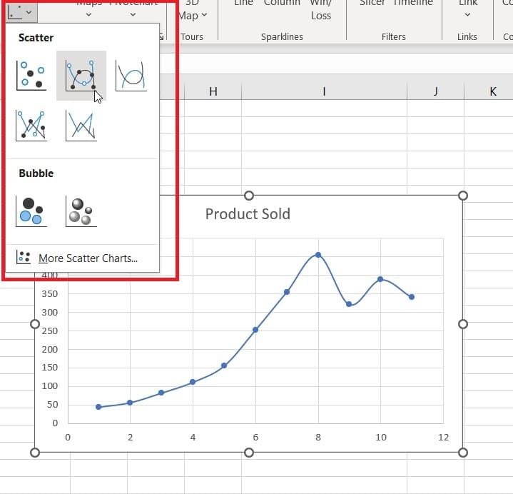
Now, go to the Insert tab, and click on the scatter icon.

When you do, a menu will appear on the screen from where you can select different designs for the scatter plot.
Step
Customize the scatter plot
After creating a scatter plot in Excel, you can use the icons on its right side to customize it.

If you click on the + icon, you can choose from different chart elements, such as gridlines, error bars, trendlines, and more.
Similarly, clicking on the brush icon will allow you to change the color and design of the scatter plot.
How to make a scatter plot in Excel on Mac
The method of creating a scatter plot in Excel on Mac is not vastly different from the Windows version, and here’s how you can do it.
Step
Open the worksheet
Open the worksheet that contains the data you want to plot on a scatter chart.
Step
Select X Y Scatter
Select all the data you wish to be included in the scatter plot.
Then, click the Insert tab, and select X Y Scatter. Next, under Scatter, pick your chosen chart.
Step
Select the Chart Design tab
With the scatter plot created, you can begin to edit and design your chart. Select the Chart Design tab to access your options.
- From Chart Design, you can modify the titles, labels, legend, etc. using Add Chart Element.
- Use Quick Layout to select from predefined chart elements.
- In the Style Gallery, you can change the layout and style using previews.
- Adjust the data view using Switch Row/Column or Select Data.
- Use the Design tab to change the shape fill, outline, and effects.
Conclusion
A scatter chart is a clear and efficient way to display data. Converting the data from an Excel worksheet into a scatter plot makes it easier for users to view and assess correlations. In this guide, we have explained how to make a scatter chart in Excel, so you can hopefully now make your sheets look more professional.
Learn more about Excel through these guides:
About the Author