
Want to know how to label axis in Excel? We’ve got you covered.
If you frequently use charts, you’ll know what an axis label is. However, knowing how to implement one in Excel is a different story. Like most things in Excel, once you know how to do it, it’s super easy and can give the user more information about the chart in question.
Axis labels aren’t displayed by default, so you’ll need to add them manually, and of course, you have both horizontal and vertical axes that you can label. This guide will explain how you can label axis in Excel.
How to add axis labels to a graph in Excel
Scenario on hand: We have an Excel graph of supermarket sales.
What we want to accomplish: Explore how to add axis labels to a graph in Excel using the following ways:
- Enable the axis titles
- Enable the axis titles from ‘Chart Design’
- Enable only horizontal or vertical axis titles
- Automating the axis title
- Format axis titles
- Removing axis titles
Enable the axis titles
The first method is for you if you want to enable and label both horizontal and vertical axes titles.
Step 1: Enable the axis titles
By default, your Excel chart might not have any axis labels. So, the first step is enabling the axis titles.
To do this, click your Excel graph. This will show three options on the top right of the chart. Click the ‘+’ icon:
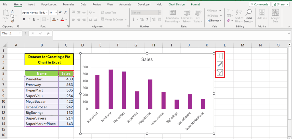
This option opens up a menu where the axes, chart titles, and gridlines will be enabled as default. Tick mark on the axis titles to enable it:
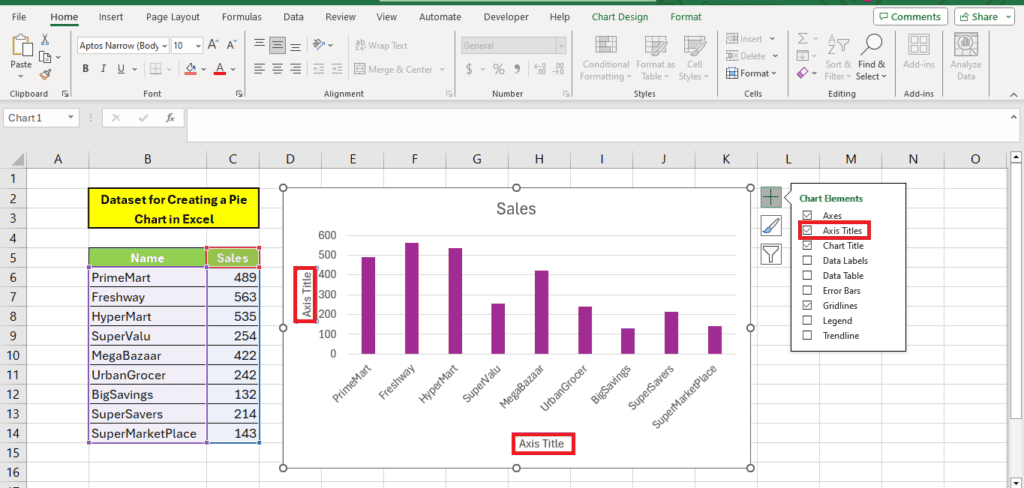
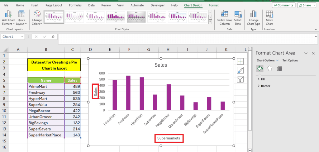
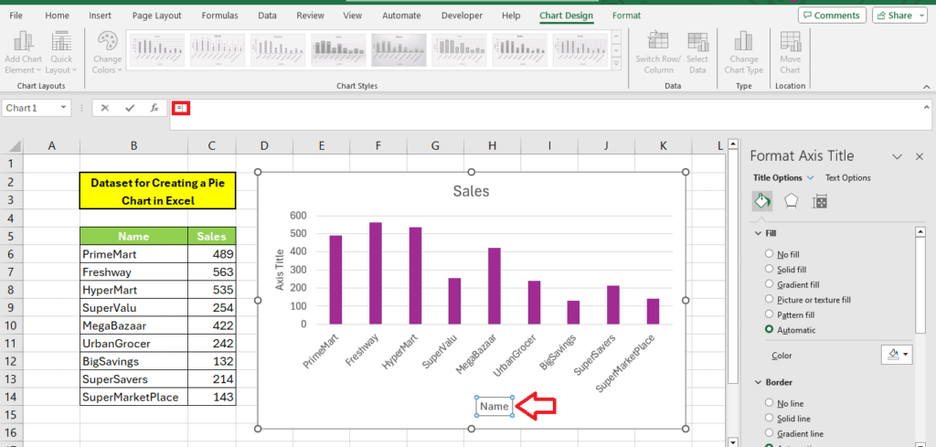
Step 2: Label the axis titles
Once you have the axis titles enabled, you can rename them to your suited titles. Here’s how we labeled it according to our dataset:
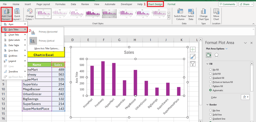
Enable the axis titles from ‘Chart Design’
Another way to enable the axis titles is from the ‘Chart Design’ tab. This is a tab that you will see on the top when you select your chart.
When you click this tab, you will see an option ‘Add Chart Element’ on the right. You can turn chart elements on and off using this option:
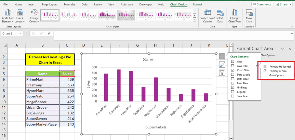
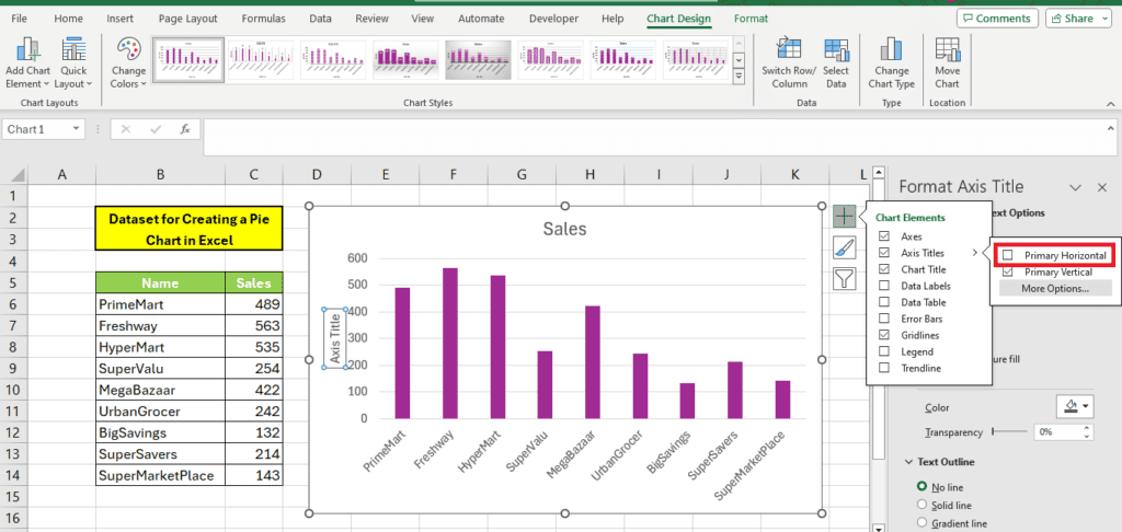
Enable only horizontal or vertical axis titles
If you’re using a dual-axis chart, vertical or horizontal axis options will be shown automatically, but some charts won’t always require both. You may just need a vertical axis label or a horizontal axis label.
To do this, go back to step 2, where the plus sign is. From here, you’ll be met with the ‘Chart Elements’ window again, but if you hover over ‘Axis Titles, ’ a black arrow will appear.
Click this, and you will see a checkbox for both vertical and horizontal axes. Simply untick the one you don’t need, and it will disappear.
Automating axis titles
If you’d like to automate the text of the axis labels, you can actually create a reference from the axis title to a cell, and it’s really quite simple.
Select the axis title and write the ‘=’ symbol in the formula bar, like you would if you were creating a regular formula in Excel.
Then, left-click on the cell containing the axis title you want, like you would if you were creating a regular reference, and then press enter.
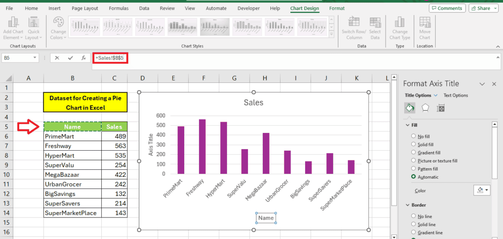
So now, when the text in the axis title cell changes, the axis label will change automatically, too. It’s easy to do and saves you the hassle of going back and forth and changing the title if the chart is a draft.
You can also use this method to automate the graph’s title and the axis labels.
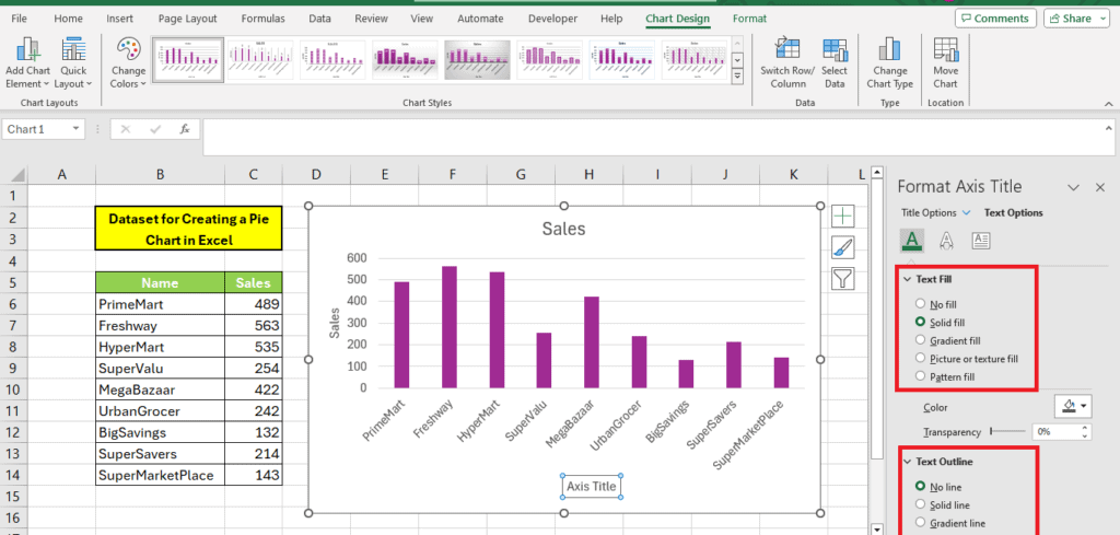
Format axis titles
If you want a bit of character to your axis title instead of the dull block text, why not format it? It’s simple to do, and it’ll give your chart a bit of extra character.
Right axis title and click ‘Format Axis Title’ to open formatting options.
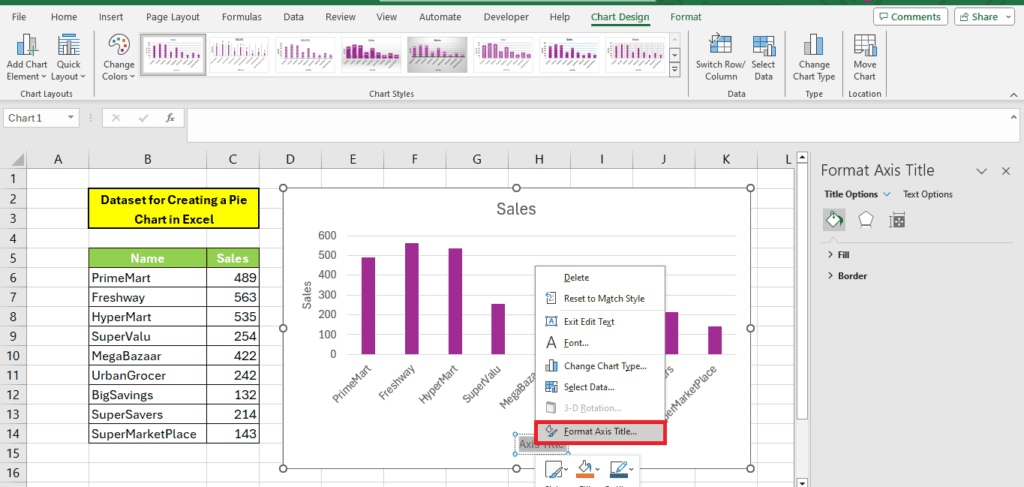
From here, you can change the fill and border for the axis title:

From ‘Text options’ you can change the color, text fill, and text outline:
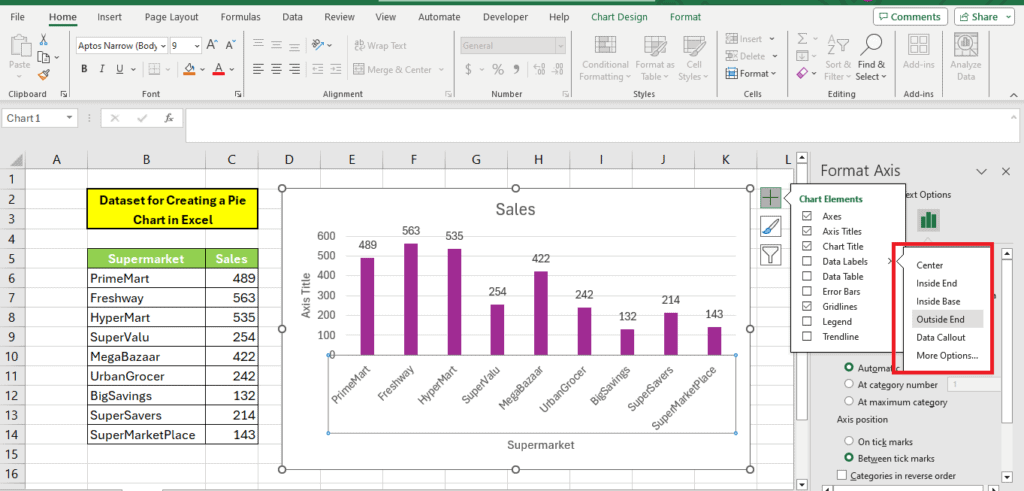
You can even change the placement of the data labels from the menu options by clicking ‘Data Labels’:
Removing the axis title
Removing the axis title is as simple as enabling them. You can remove the axis titles by just left-clicking on them and pressing the Delete button.
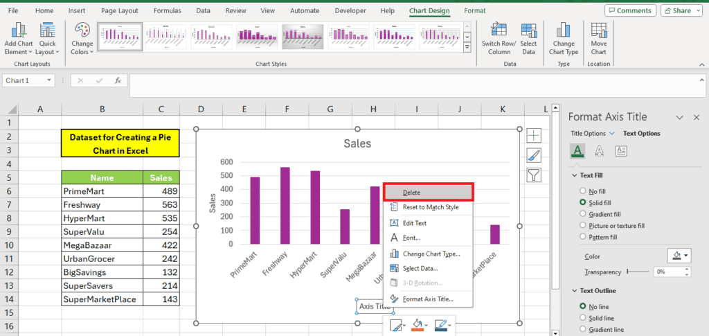
Alternatively, you can just uncheck the ‘Axis Title’ option in the ‘Chart Elements’ window, which will eliminate the axis titles for you.
Wrapping up
Excel is a great tool for creating data visuals because of its excellent and sophisticated chart features. We have shown you that adding and formatting your graph’s axis labels is straightforward in just a few simple steps. Hopefully, now you have all the necessary information to make awesome graphs and charts for your next project.
If you want to learn more about Excel, give these guides a read: